
Infogroup / Data Axle

Platform internal tooling
challenge:
User research exposed Infogroup had a highly manual process to ingest, clean, and distribute data that took on average 6-7 weeks. Each of the 6 data cleansing teams used different tools and processes, had no consistent way to measure quality across all teams and varied means to ingest new data. Software for a number of the tools was ASCII based key-code software and had an immensely high learning curve, was difficulty to update, and stored data on-site in an AS/400 database in Omaha, NE.
goal:
Unify and simplify the numerous on-prim workflows into a single cloud-based software platform. Standardize on a common definition of quality for all teams. Standardize data distribution.
process:
UX research / Design, design socialization, Facilitation with Engineering, iteration.
results:
We created a simplified cloud-based, highly automated data processing platform, with more accurate data output and easier, standardized distribution through API. Business record updates which previously took 6-7 weeks to process, were now processed in under 24 hours and accessible through an API via AWS.
Simple CTAs and affordances promoting awareness, trust, and engagement.
Consistent interaction patterns, common taxonomy and standardized components.
Improved accuracy and fill rate with easier access to data in the cloud.
my role:
User research, Design, Design socialization and cross-collaboration with Data Cleansing teams, Product Management and Engineering teams.
Online documentation
challenge:
Documentation was being created by various individuals in varied formats and shared by hand or email, leading to issues with version control and accuracy.
goal:
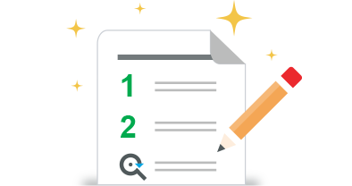
Reduce inconsistencies and make our documentation accessible from one consistent location on the platform website. Utilize Data Axle visual system, including illustrations and infographics to simplify complex concepts.
process:
Collaboration, solicitation of feedback and iteration.
results:
Easily accessible online documentation
Sales teams, technical support teams and end-customers had access to the most current documentation from one consistent, trusted source.
Illustrations helped lighten the stuffy technical tone providing approachable aspects of life and emotion.
Verbiage, taxonomy and overall messaging updated and adjusted through iteration as our offerings evolved.
various documentation pages


additional illustrations

my role:
User research, Design, Illustration, Design socialization and cross-collaboration with Data Cleansing teams, Product Management and Engineering teams.
Data Axle platform definition & branding
challenge:
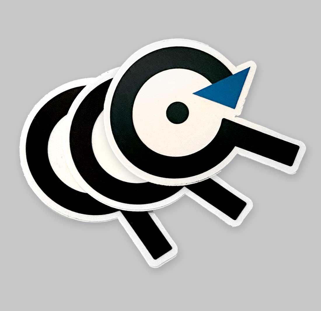
Infogroup had various data teams for different products, each with a distinct name. Our team, the platform team named Data Axle, needed a visual identity to showcase it as the main hub for Infogroups offerings: searching, submitting, and subscribing to real-time data.
goal:
Design a logo and a visual identity for Data Axle to provide better visibility of it as Infogroup’s premier platform focused on quality near real-time data distribution. Logo was to be used on the website, internal tools, data interfaces, and business/sales materials.
process:
Collaboration, solicitation of feedback and iteration.
A logo inspired by three main functions of the platform’s technology: data ingestion, data cleansing and real-time data availability and distribution.
Modern visual representation that differentiated the platform team from previous dated data solutions
“Data Axle” platform name became synonymous with trust and data quality to Infogroup customers. Within a few years, Infogroup rebranded to Data Axle with core tenets based on this work.
results:

my role:
Stakeholder interviews, Industry Audits, User research, Design, Design socialization and cross-collaboration with Platform CTO and Infogroup Branding and Marketing.
Platform visual system
challenge:
No visual language or conduit to convey complex data compilation in simplified terms.
goal:
Explain platform benefits to non-technical (Non-Engineering) minded customers in simple language. Transform technical documents into clear visual stories, and ensuring the content remains accurate and comprehensive.
process:
Collaboration, solicitation of feedback and iteration.
results:
A visual identity system that extended the messaging and intention behind the platform’s logo creation (data ingestion, data cleansing and real-time data availability).
Illustrations and infographics, connecting real-world use cases with capabilities platform data would provide organizations.
A More approachable and consistent visual language that provided levity to the dry technical documentation that was focused solely on implementations.
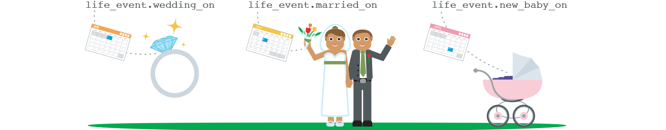
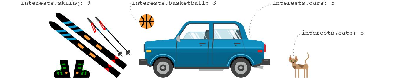
Inclusion of Consumer data and B2C database content.
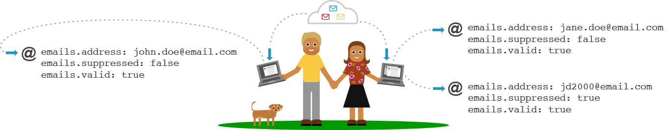
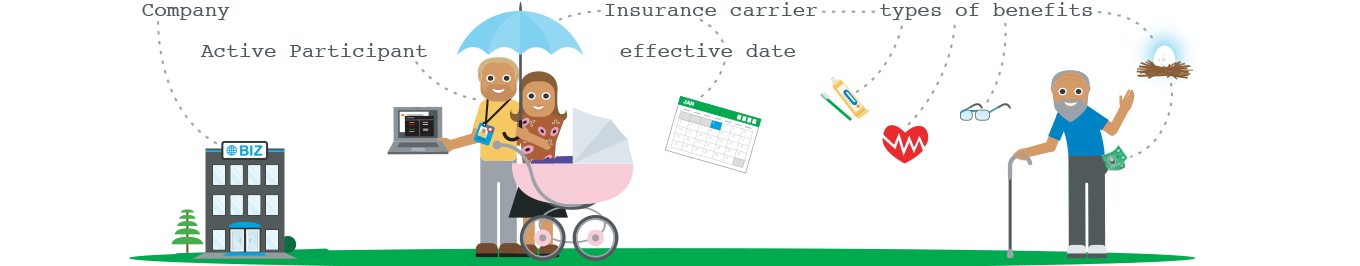
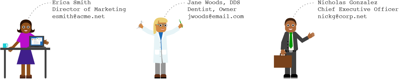
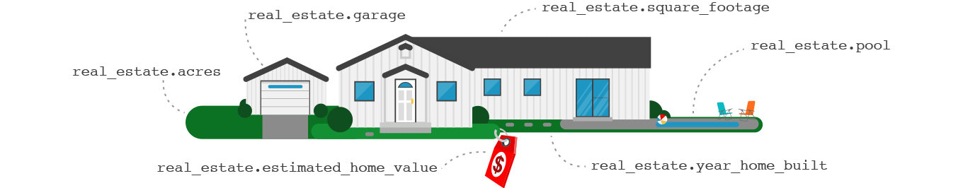
Business, Consumer and B2C Database Artwork
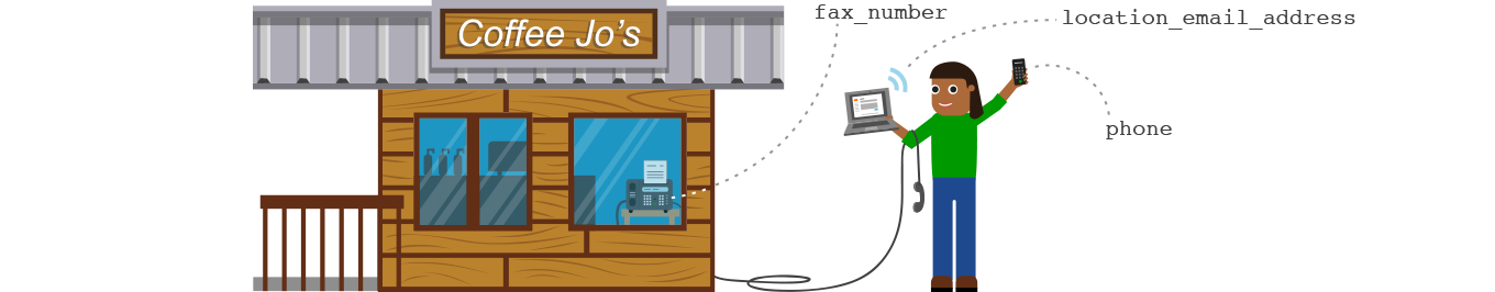
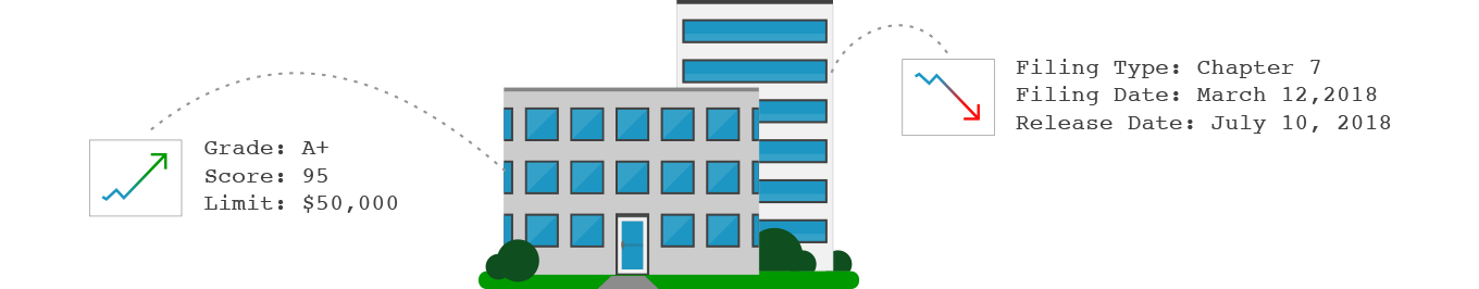
Infogroup has three distinct databases; Business data, Consumer data, and B2C data that was represented with the artwork below. Each database included a variety of related segments that customers can select and choose to license.

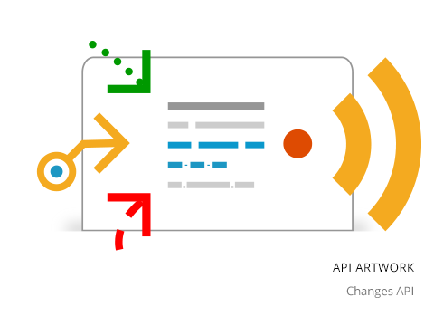
APIs
The Data Axle platform had seven APIs represented by distinct artwork that alluded to their core functionality, while included aspects of search, submit and subscribe.


Platform artwork
Illustrations and infographics supplemented conference media, presentations, monthly newsletters and email blasts, providing a more colorful and approachable understanding of the concepts and technologies.


Conference animation - Narrated by our CTO at the conference (narration not available).
my role:
Stakeholder interviews, Industry Audits, User research, Design, Design socialization and cross-collaboration with Platform CTO and Infogroup Branding and Marketing.
Self signup / free trial workflow
challenge:
Product managers, Sales and Support teams were regularly randomized with new or prospective customer discussions about our data solutions, technologies, setting up free trials. This required substantial introductory hand holding.
goal:
Create a self-signup process for customers to register for a free trial of our platform's APIs and technologies. This introductory process would help users understand our data model better and clarify their future interactions. Users would be able to select and filter datasets that suit their business needs while learning about our products and services. Consequently, this method will reduce the need for heavy Product Management, Sales, and Support involvement, resulting in cost savings.
process:
UX Research / Design processes, Collaboration, solicitation, and iteration.
results:
A workflow where customers could signup for a free 30 day trial of our business, consumer or B2C data.
Empowered customers with hands on engagement
Substantial increase in self-signup activity
Dramatic reduction of Product management, Sales and Support randomization, enabling reprioritization of time for other important business initiatives.
Operational cost savings for internal teams
Highlighted the need to expand self-service efforts
my role:
User research, Design, Design socialization and cross-collaboration with Data Cleansing teams, Support, Product Management and Engineering teams.